Challenge
Within Salesforce, the “How-to” articles were located within an area called “Knowledge.” When someone needed to consult any of them, they had to exit the billing form flow and enter this area, disrupting the experience.
Solution
Proactively, the UX Design team at Banco ABC Brasil analyzed the scenario and determined that displaying links to the articles on the screen related to the subject would provide the best experience. As it was a completely new solution, we held meetings with product owners and Salesforce developers to assess its technical feasibility. After receiving approval from the respective areas, the project was developed and adopted in other flows.
Smart assistance
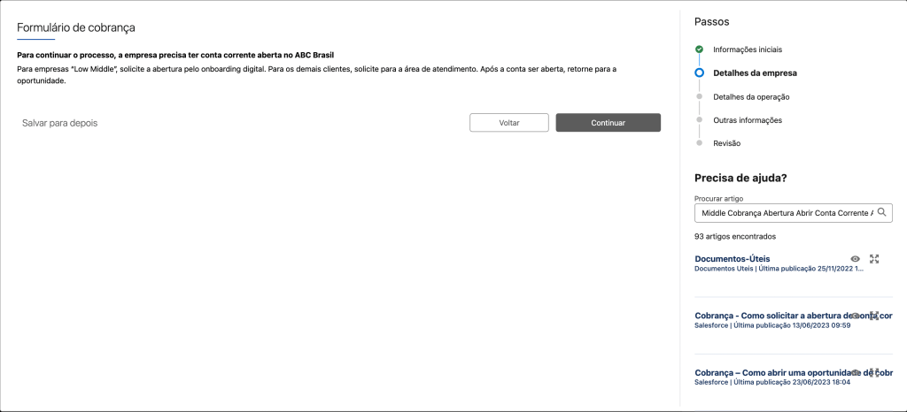
Links to specific articles appear automatically as the person progresses through the billing form. They are located at the bottom right of the image.
Seamless Experience
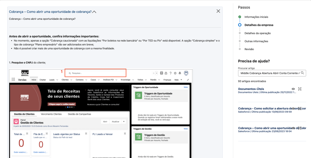
The article appears on a screen overlaying the billing form screen. This way, it is no longer necessary for the person to exit the flow to read the content.
Benefits
- More consistent billing form experience: professionals stay within the flow at all times;
- Reduction in form completion time: no need to search for the file or exit the flow anymore.
